Fuji Graphic LK
Oct 15, 2024
$$$

Typography is more than just a visual element; it is a critical component of graphic design that plays a significant role in conveying a message, creating an emotional response, and establishing brand identity. The choice of typeface can greatly influence how the audience perceives information and interacts with content. This article delves into the key aspects of typography, its impact on effective design, and best practices to harness its power.
At its core, typography refers to the style, arrangement, and appearance of text. It encompasses various elements such as font type, size, line length, line spacing, letter spacing, and alignment. Understanding these elements is essential for any designer as they collectively affect readability, visual hierarchy, and the overall aesthetic of a design. Effective typography balances creativity with functionality, ensuring that the message is communicated clearly while engaging the audience visually.
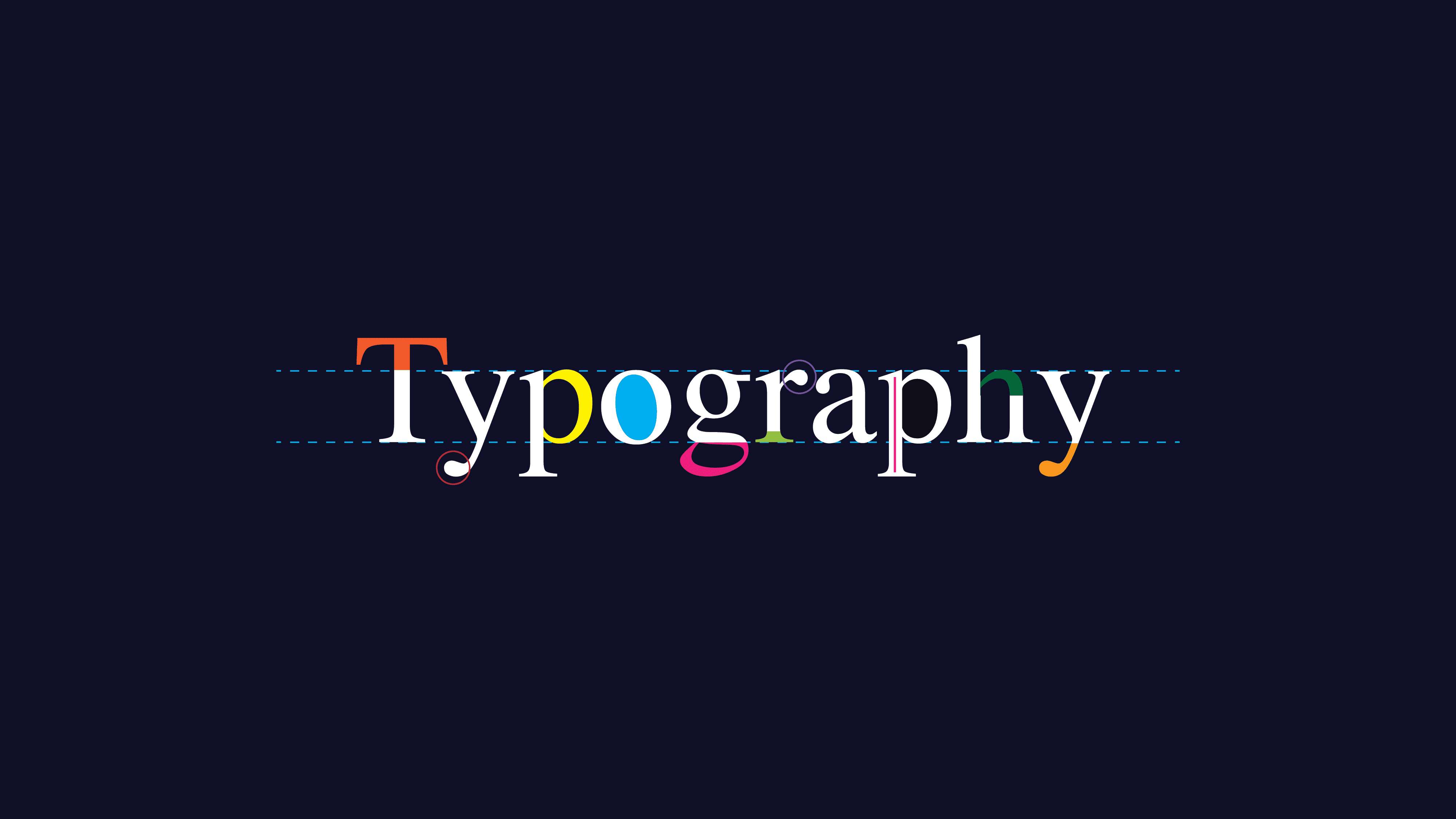
Each typeface has distinct characteristics that contribute to its overall look and feel. The anatomy of a typeface includes elements such as serifs (the small lines or decorative strokes at the ends of letters), ascenders (the parts of lowercase letters that extend above the x-height, like ‘b’ or ‘d’), and descenders (the parts that extend below the baseline, like ‘p’ or ‘g’). Understanding these anatomical features helps designers choose appropriate typefaces for specific projects, enhancing both aesthetics and readability.
Readability is one of the most crucial aspects of typography. A well-chosen typeface can make content easier to read, while poor typography can lead to confusion and disengagement. Factors such as font size, line length, and spacing all influence how easily a reader can process information. For instance, longer line lengths can hinder readability, while adequate line spacing can create a more inviting reading experience. Designers must carefully consider these elements to ensure their typography enhances comprehension.
Typography is a powerful tool in branding. Many well-known brands have unique typefaces that embody their identity and values. For example, Coca-Cola’s cursive font evokes a sense of nostalgia and warmth, while Google’s simple sans-serif font communicates modernity and accessibility. Consistent use of typography across all brand materials—such as websites, advertisements, and packaging—helps establish a cohesive brand identity, making it instantly recognizable to consumers.
Visual hierarchy is another critical concept in typography. It refers to the arrangement of text elements to guide the reader’s eye and convey the importance of information. By manipulating size, weight, and placement, designers can create a clear hierarchy that directs attention to key messages. For instance, using larger headings to introduce sections and smaller body text for descriptions helps readers navigate content effectively. Understanding and implementing hierarchy in typography is essential for effective communication.
Combining multiple typefaces can add depth to a design, but it also poses challenges. Designers must select fonts that complement each other in style, weight, and tone. A common approach is to pair a serif typeface with a sans-serif typeface, as the contrast often creates visual interest. For example, a bold serif for headlines paired with a clean sans-serif for body text can result in an aesthetically pleasing and legible design. Resources like Google Fonts and Adobe Fonts offer extensive libraries of typefaces that can be experimented with for effective pairings.
Variable fonts are an innovation in typography that allows for a single font file to contain multiple styles and weights. This technology not only reduces the need for multiple font files, thus optimizing web performance, but also offers designers greater flexibility. By adjusting parameters such as width and weight, designers can create customized text that fits the specific needs of a project. Understanding how to use variable fonts can open up new avenues for creativity and efficiency in typography.
Typography has the unique ability to evoke emotions and set the tone for a design. The choice of typeface can influence how a message is perceived. For instance, a playful script font may evoke a sense of joy and friendliness, while a bold, geometric sans-serif may communicate strength and professionalism. Designers should carefully consider the emotional implications of their type choices, aligning them with the intended message and audience.
To achieve impactful typography, designers can follow several practical guidelines:
There are numerous tools and resources available to help designers master typography. Software like Adobe Illustrator and Photoshop offers advanced typography options, while web-based platforms like Canva provide user-friendly templates and design features. Typography-focused websites, such as Typewolf and Fonts In Use, showcase typefaces in action and inspire design choices.
Typography is a fundamental aspect of graphic design that can significantly influence how a message is conveyed and perceived. By understanding the intricacies of typography—including its anatomy, impact on readability, role in branding, and emotional influence—designers can create effective and engaging visual communication. Mastering typography not only enhances the quality of design but also strengthens the connection between the designer and the audience, ensuring that messages resonate and leave a lasting impact.
Stay updated with the latest design trends, tips, and exclusive offers from Fuji Graphic LK! Sign up for our newsletter and never miss an update.

we create stunning designs in digital and print, web development, and merchandise to elevate your brand.
Our team at Fuji Graphic LK is available to assist you